# Interactive Plots and Tables
Finch Studio provides a suite of interactive plots and tables that are seamlessly available to allow the modeler to quickly explore their data, understand their modeling results, triage and debug model or dataset issues, and make decisions on next steps in their analyses. Options are present to color, stratify, or filter by covariates of interest, show individual subject dosing times, add dataset variables to the interactive tooltip, and more.
# Requirements
# Observed Data Plots and Tables
| Plot/Table | Description | Requirements |
|---|---|---|
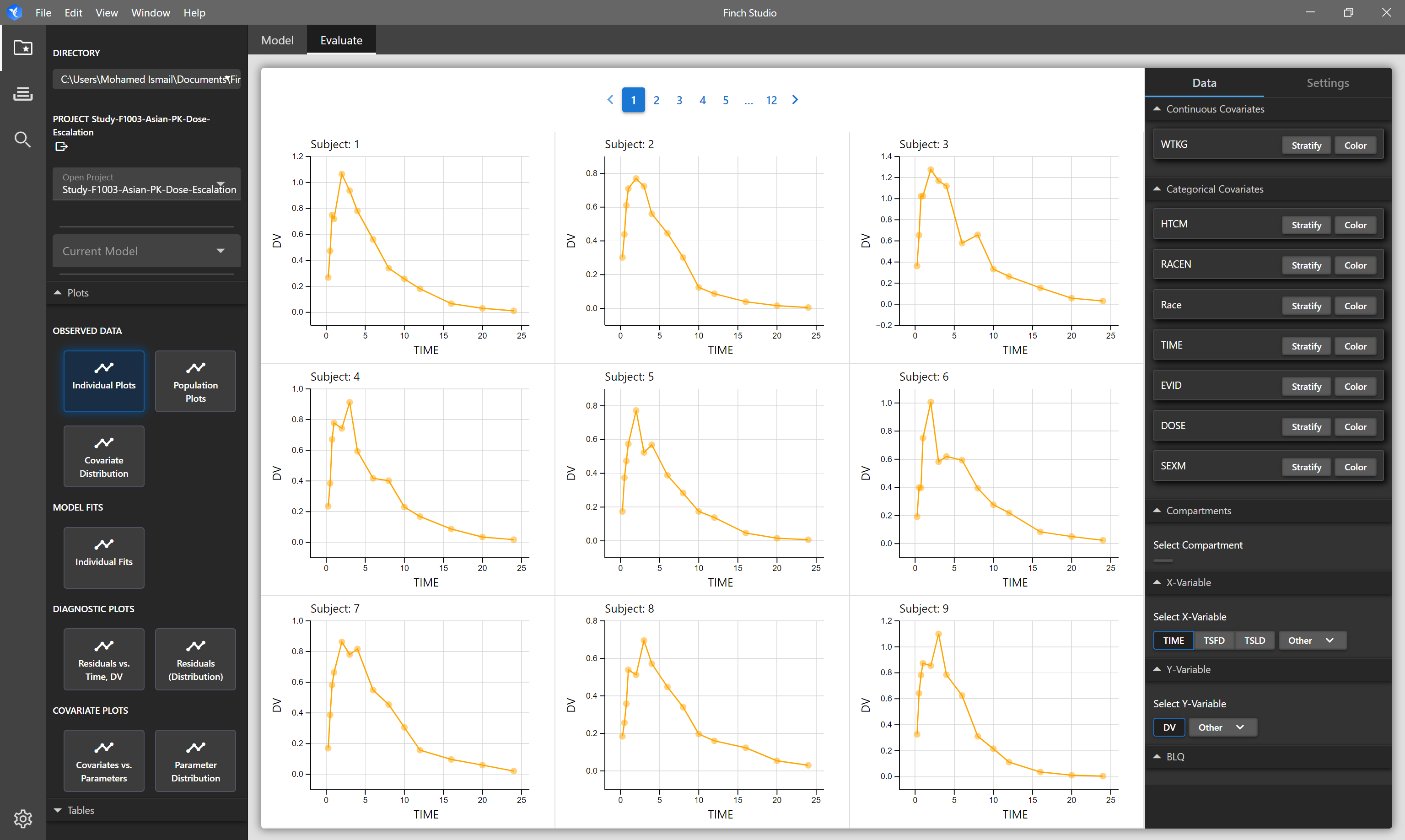
| Individual Plots | Each subject in the dataset is shown on a seperate plot. By default TIME vs DV columns are plotted. |
|
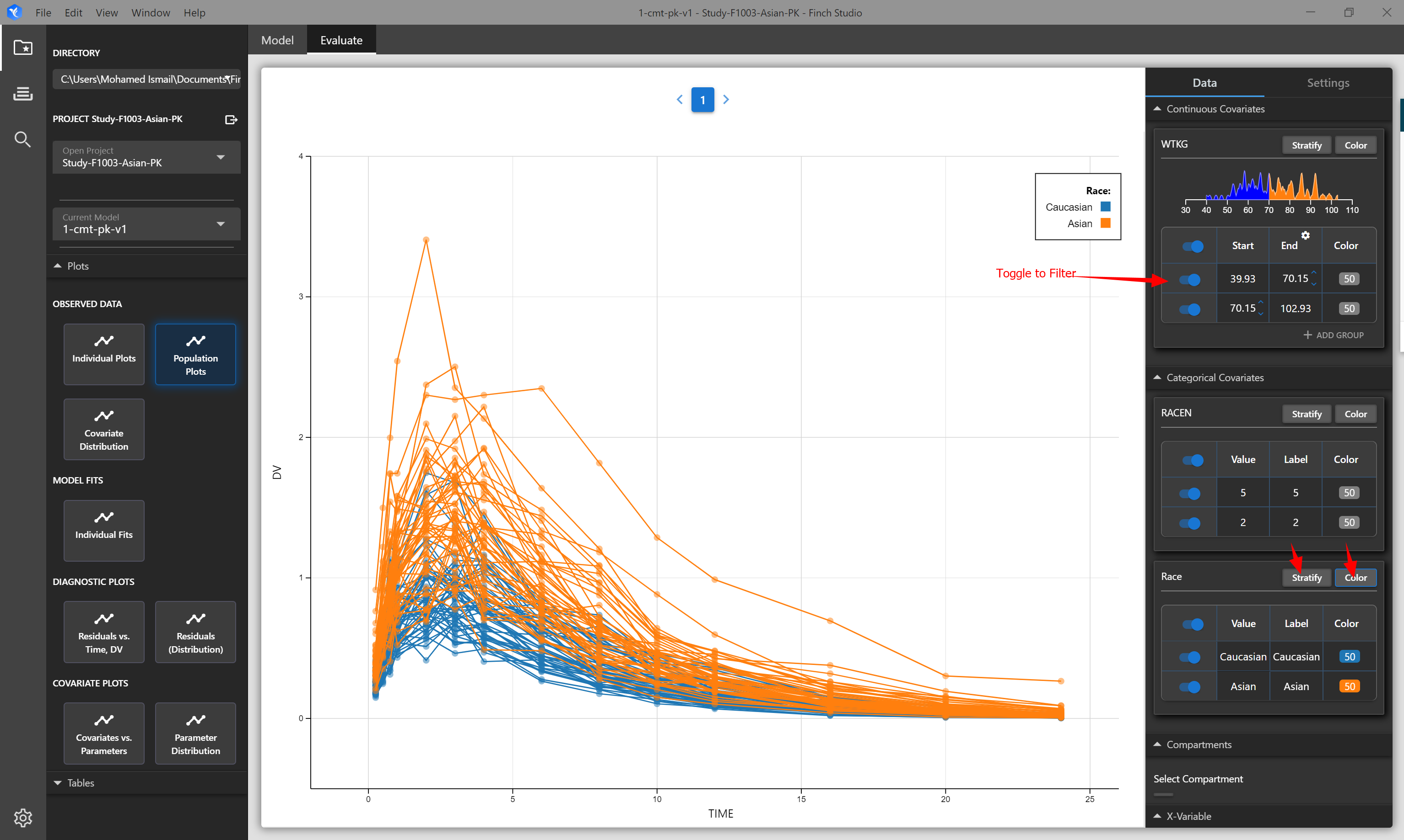
| Population Plots | Spaghetti plot of all subjects in the dataset. Hover over lines to see subject ID. By default TIME vs DV columns are plotted |
|
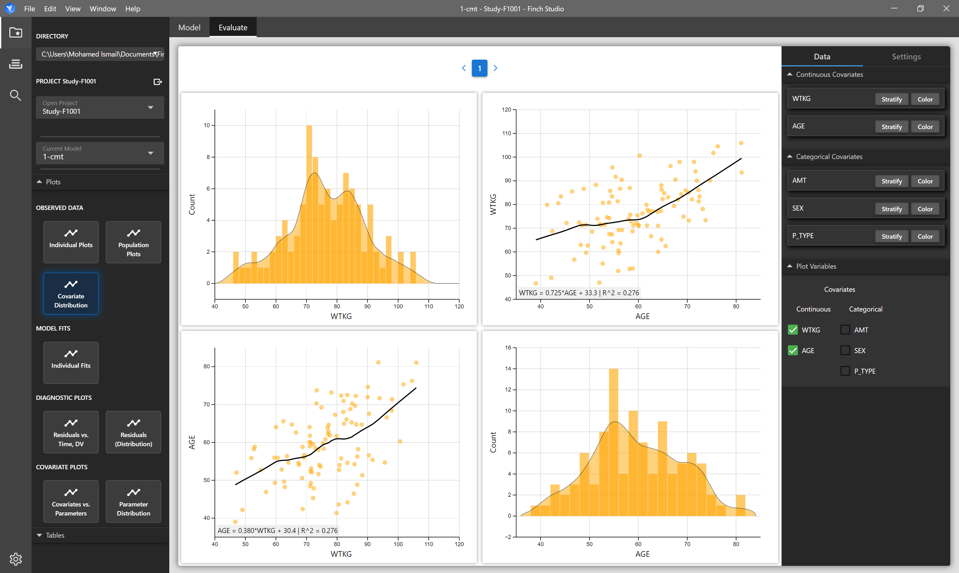
| Covariate Distribution Plot | Matrix of plots showing the distribution of selected covariates in your input dataset on the diagonals, and on the off-diagonals, correlation plots of the selected covariates are shown. | NONMEM formatted dataset. Mapped covariate columns will be available to select. |
| Observed Summary Stats Table | Summary statistics of your input dataset. | NONMEM formatted dataset. |
# Results Plots and Tables
The modeling results plots and tables (individual fits, diagnostic plots, parameter distribution plots, etc) are reliant on the correct NONMEM output tables being present after the model finishes running. Naming conventions for NONMEM output tables required by Finch Studio follow xpose conventions. The key tables that are needed are detailed below. The file names of the tables should always be named exactly as shown (sdtab1, patab1, cotab1, and catab1), since that is what Finch Studio looks for to create the interactive plots. Do not change the number at the end of the table names, this should always be 1.
| Table | Description | Example |
|---|---|---|
| sdtab1 |
| $TABLE ID TIME TSLD DV MDV EVID IPRED BLQ CWRES IWRES ONEHEADER NOPRINT FILE=sdtab1 |
| patab1 |
| $TABLE ID KA CL V ETAS(1:LAST) ONEHEADER NOPRINT FILE=patab1 ; model parameters |
| catab1 | Categorical covariates (e.g. SEX, RACE, etc) | $TABLE ID RACEN ONEHEADER NOPRINT FILE=catab1 ; categorical covariates |
| cotab1 | Continuous covariates (e.g. WTKG, AGE, etc) | $TABLE ID WTKG ONEHEADER NOPRINT FILE=cotab1 ; continuous covariates |
Example code in NONMEM control stream to request the output tables required by Finch Studio:
$TABLE ID TIME DV MDV EVID IPRED CWRES IWRES ONEHEADER NOPRINT FILE=sdtab1
$TABLE ID KA CL V ETAS(1:LAST) ONEHEADER NOPRINT FILE=patab1 ; model parameters
$TABLE ID RACEN  ONEHEADER NOPRINT FILE=catab1 ; categorical covariates
$TABLE ID WTKG   ONEHEADER NOPRINT FILE=cotab1 ; continuous covariates
| Plot/Table | Description | Requirements |
|---|---|---|
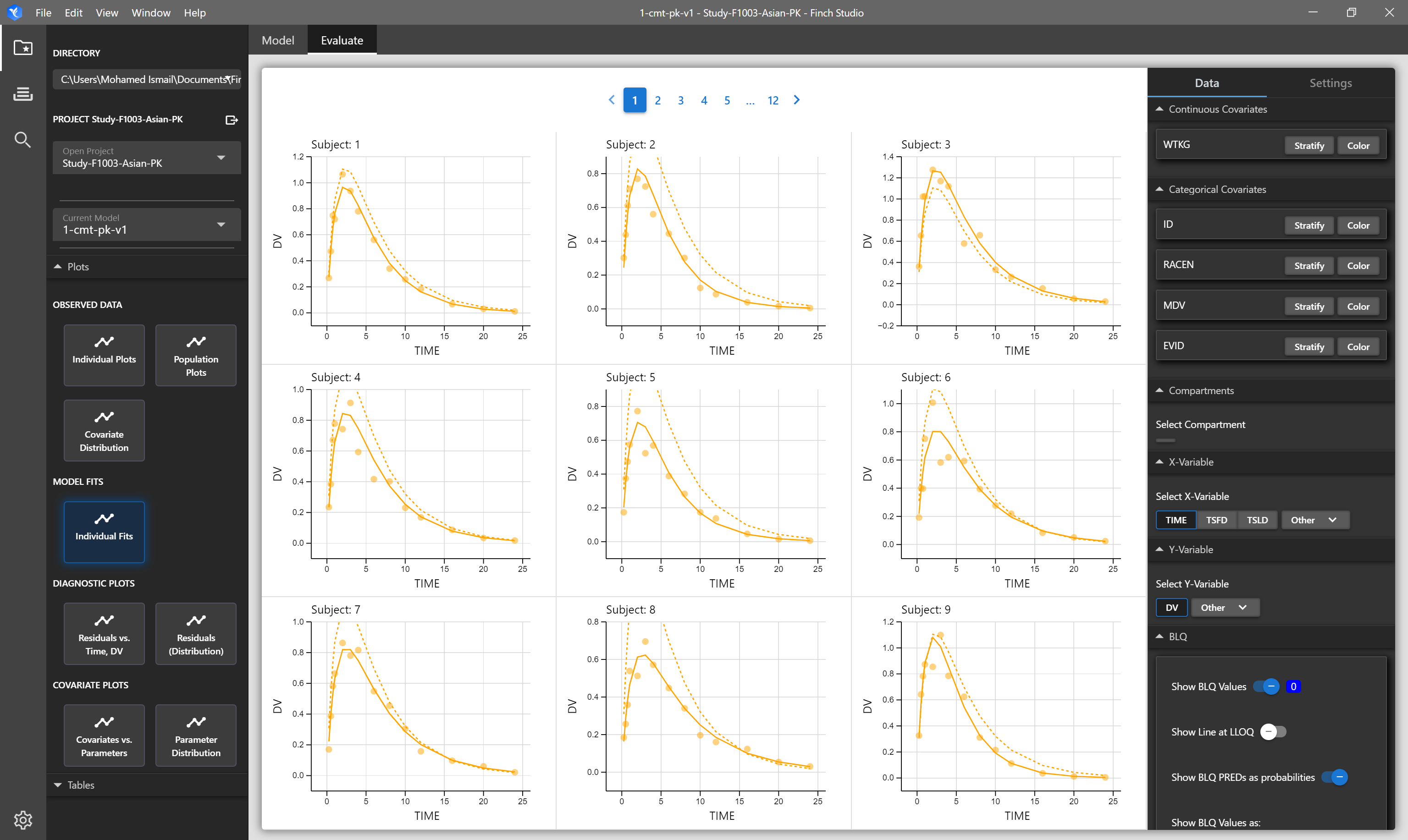
| Individual Fits | Individual subject and population predictions overlayed on individual's observed data. Solid lines represent individual prediction, dashed lines represent population prediction, and points represent observed data. | NONMEM Output Tables: sdtab1, patab1, cotab1, catab1 |
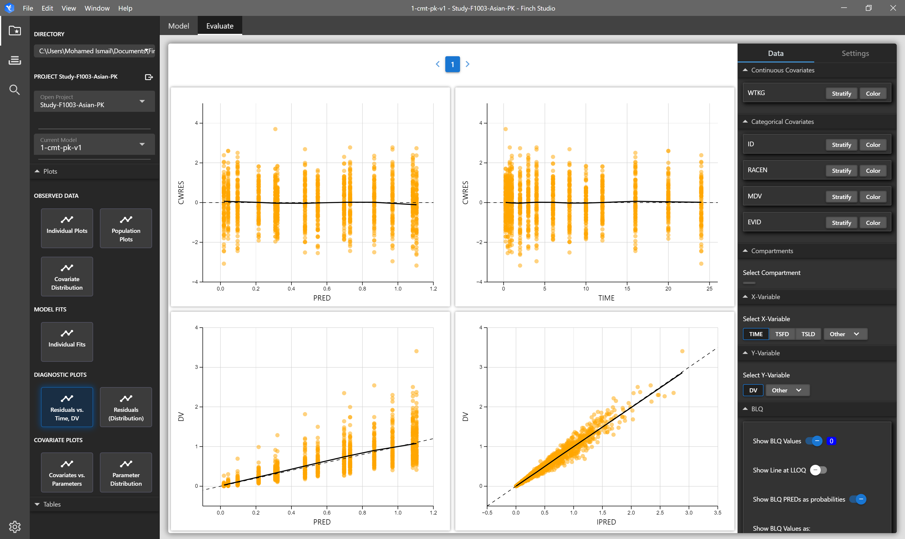
| Residuals vs Time, DV | Four panel plot of CWRES vs PRED, CWRES vs TIME, DV vs PRED, and DV vs IPRED. Options are available to change the residual and/or independent varaibles (i.e. TIME, TSLD) being plotted in the plot settings menu. | NONMEM Output Tables: sdtab1, patab1, cotab1, catab1 |
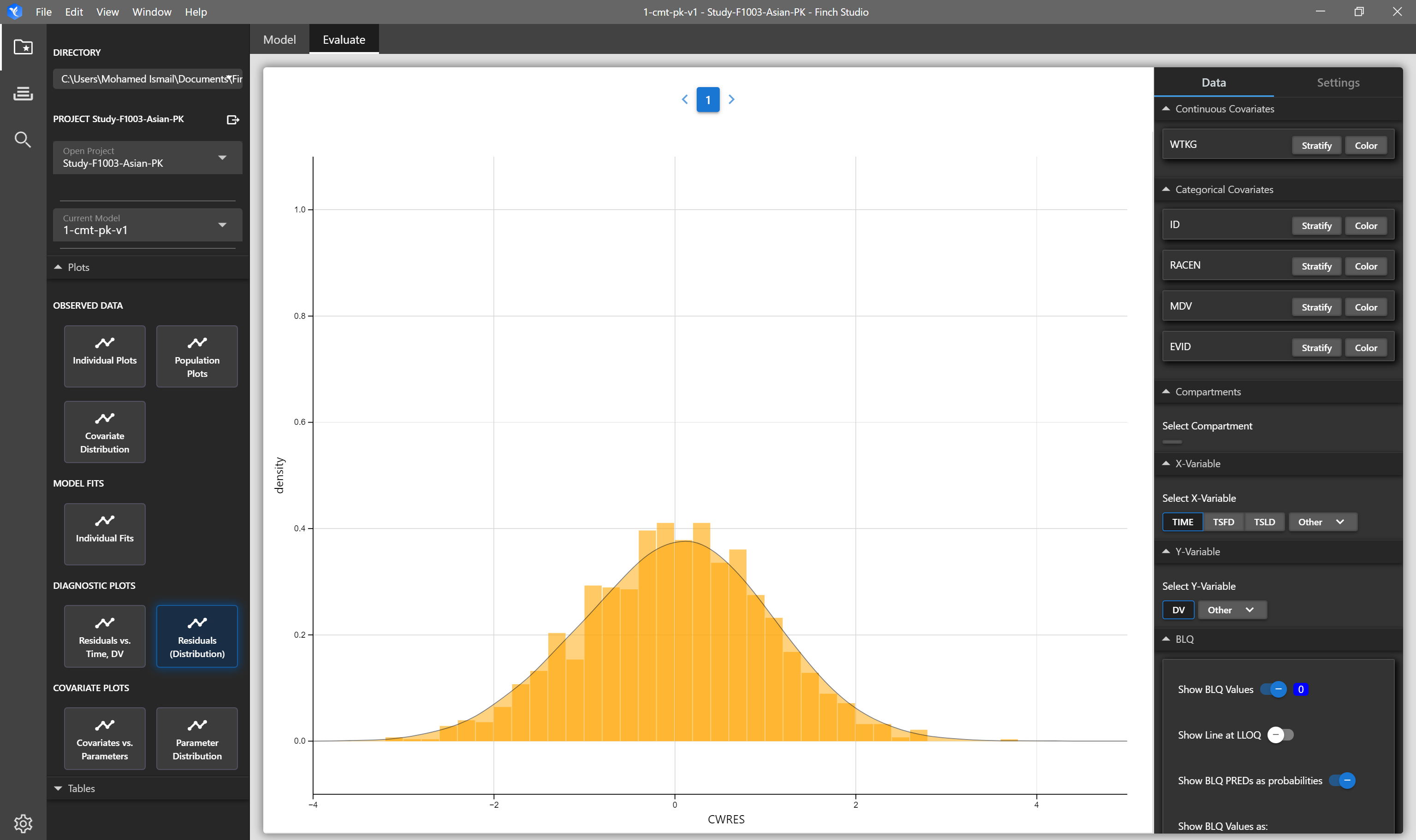
| Residual Distribution | Distribution (density and histrogram overlays) of residuals. | NONMEM Output Tables: sdtab1, patab1, cotab1, catab1 |
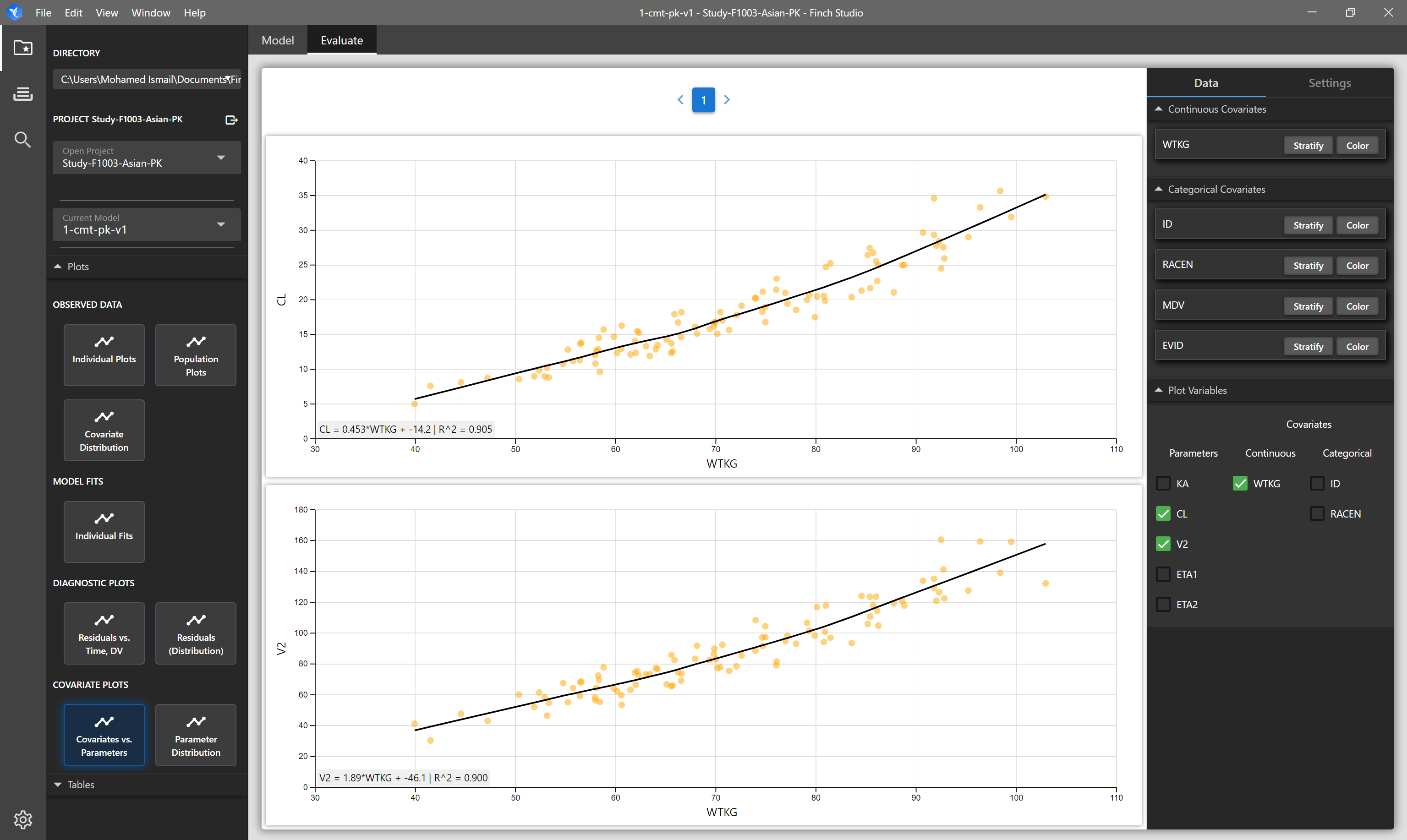
| Covariates vs Parameters | Matrix of plots of selected covariates vs selected parameters | NONMEM Output Tables: sdtab1, patab1, cotab1, catab1 |
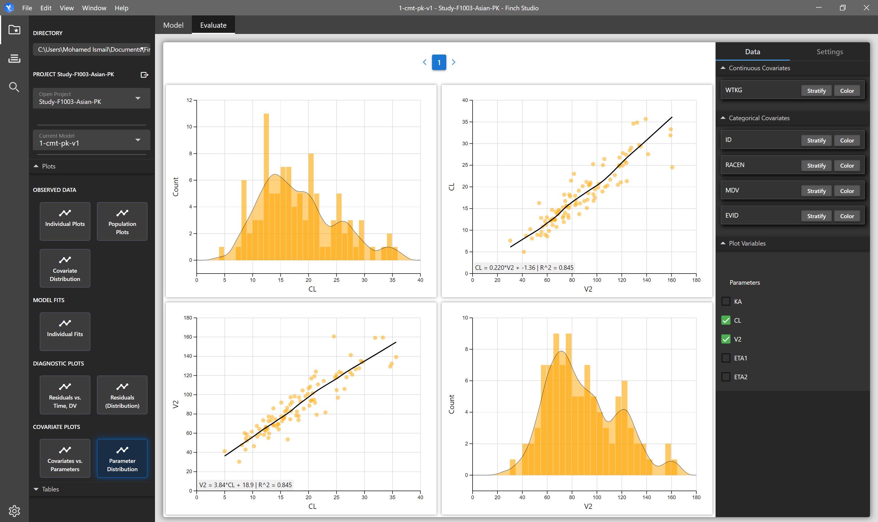
| Parameter Distribution | Matrix of plots showing the distribution of selected parameters on the diagonals, and on the off-diagonals, correlation plots of the selected parameters are shown. | NONMEM Output Tables: sdtab1, patab1, cotab1, catab1 |
| Parameter/OFV Convergence | OFV and parameter search history from the model run. Can be updated live as the model is running to track progress. | .ext file within the model directory, or within the most recently created modelfit_dir subdirectory. |
| Individual OFV Contribution | Each individual's contribtuion to the OFV, sorted from largest to smallest. | mod1.phi file. Note, if mod1.file is not present after the run completes, please ensure the PsN execute run command is specifying the .phi file to be retained (e.g. |
| Parameter Correlation | This plot shows the strength and direction of the linear relationship between each pair of parameters. Darker color represents stronger correlation. | mod1.xml file. |
| Results Summary Stats | Summary statistics of results tables. For example, summary statistics for drug clearance (or any other parameter) across cohorts, race, or any other stratifying variable of interest can quickly be generated | NONMEM Output Tables: sdtab1, patab1, cotab1, catab1 |
| SCM Results | Summary of stepwise-covariate-modeling run, showing which covariate was added or removed at each step. | scmlog.txt file within an scm_dir directory. |
# Stratifying, Coloring, and Filtering Plots
All plots within Finch provide you the ability to stratify, color (group), and filter your data to give you the flexibility you need to fully explore and understand your data. When applicable, you may also choose the X and Y variables to plot.
# Plot Settings
# Grid Layout
Specify the number of rows and columns for displaying plots. (i.e. 3 rows and 3 columns will display up to 9 total plots)
# X-axis and Y-axis Settings
Toggle between linear or semi-log axes
Choose whether the axes should be free (autoscales based on the data within each plot) or fixed (consistent across plots).
Axis Title
# Plot Options (Layers)
Different plots will allow you to toggle different layers. For example, for the population plot you can show lines, points, and mean lines.
# Tooltip Variables
When hovering over a point, Finch will display the subject ID number. If you wish to see more information about a point, you may add additonal variables to the tool tip.
# Plot Types - Observed Data
# Population Plots (Spaghetti Plot)
# Individual Plots
# Covariate Distribution (and Correlations)
# Plot Types - Model Results
# Individual Fits
# Model Diagnostics
# RES vs TIME, RES vs DV, IPRED vs DV, PRED vs DV
# Residuals Distribution
# Parameter Distribution
# Covariate vs Parameter